
We sit 13 months since the equity markets hit their high. The low in equity prices occurred about five months ago. As we noted in our last newsletter, growth in corporate profits is only now turning negative, and many past reliable signals would suggest that a period of economic softness is in front of us. History suggests that the market leads the economy. This brings the question regarding the investment markets, “was that it?”
Calling a defined market top or bottom point is impossible, so we think of tops and bottoms as processes. It takes time for excesses to be removed from the market and for the new view of future corporate profitability to grab hold. For the past four months, we have stated that we are in the bottoming process. Not an overly heroic statement, as the S&P500 index had dropped by 25% at the time. As the market has recovered over the past few months, many think we are past the worst. We may be, but even if true, it doesn’t necessarily mean the path forward is smooth, warranting an aggressive stance.
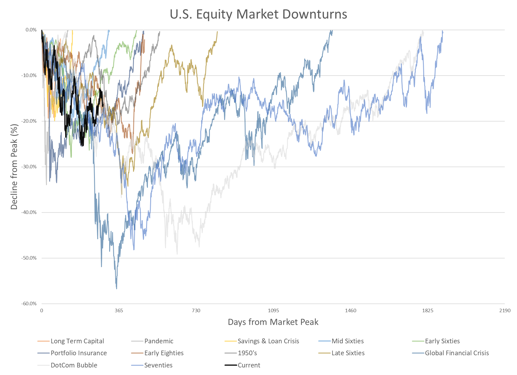 To demonstrate that downturns do not always provide a clear entry point, we decided to look at past market downturns and see how they moved through time. The chart below incorporates the major downturns (those greater than 15% off their high) starting after the Great Depression. The chart below displays the percentage decline off their respective highs. The desire is to show the severity of past declines and the time it took to hit bottom and recover to their prior highs. The black line is the current downturn showing that we are about 365 business days into the downturn and about 17% off the January 2022 high after hitting the low point of -25%.
It is common to look at downturns, but most charts that display them stop after they reach their bottoms—cutting off the recovery process. It incorrectly connotes that a bottom is a point in time. With our belief that they are processes to be worked through, looking at how investors reacted after the bottom is more encompassing.
 The chart above shows all, but it gets pretty messy fast. So, we wanted to break them down between short, intermediate, and long downturns. We took the 1-year mark (arbitrarily) as the segmentation rule for short downturns (i.e., one year to get back to the prior high) and then the 2-year mark for intermediate. For those downturns that lasted longer than two years, we put them into the long-term bucket. By doing so, can we achieve any added perspective on common elements that caused them and how investors perceived the trend from them? Let’s see.
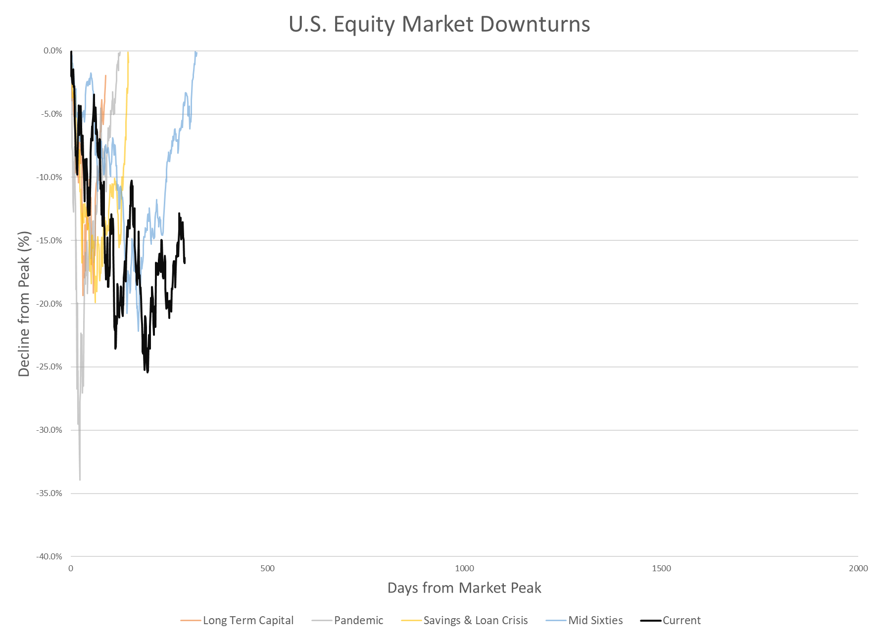
Let’s begin by reviewing events with short durations, less than or around one year. These periods are highlighted in the chart above, which includes the Russian debt crisis (also known as Long Term Capital), the recent pandemic, the Savings & Loan Crisis, and the mid-1960s. Of these, the mid-1960s was the longest and can be characterized as an adjustment to rising inflation concerns and a mild credit crunch caused by investors starting to expect prolonged government spending on the war. The other three events recovered as quickly as they declined, each facing a significant shock that rapidly reduced market leverage. The government and the Federal Reserve promptly responded to each crisis by injecting liquidity into the system and providing support to address the underlying issue. (We intentionally keep the explanations short because we assume you want something other than a history lesson).
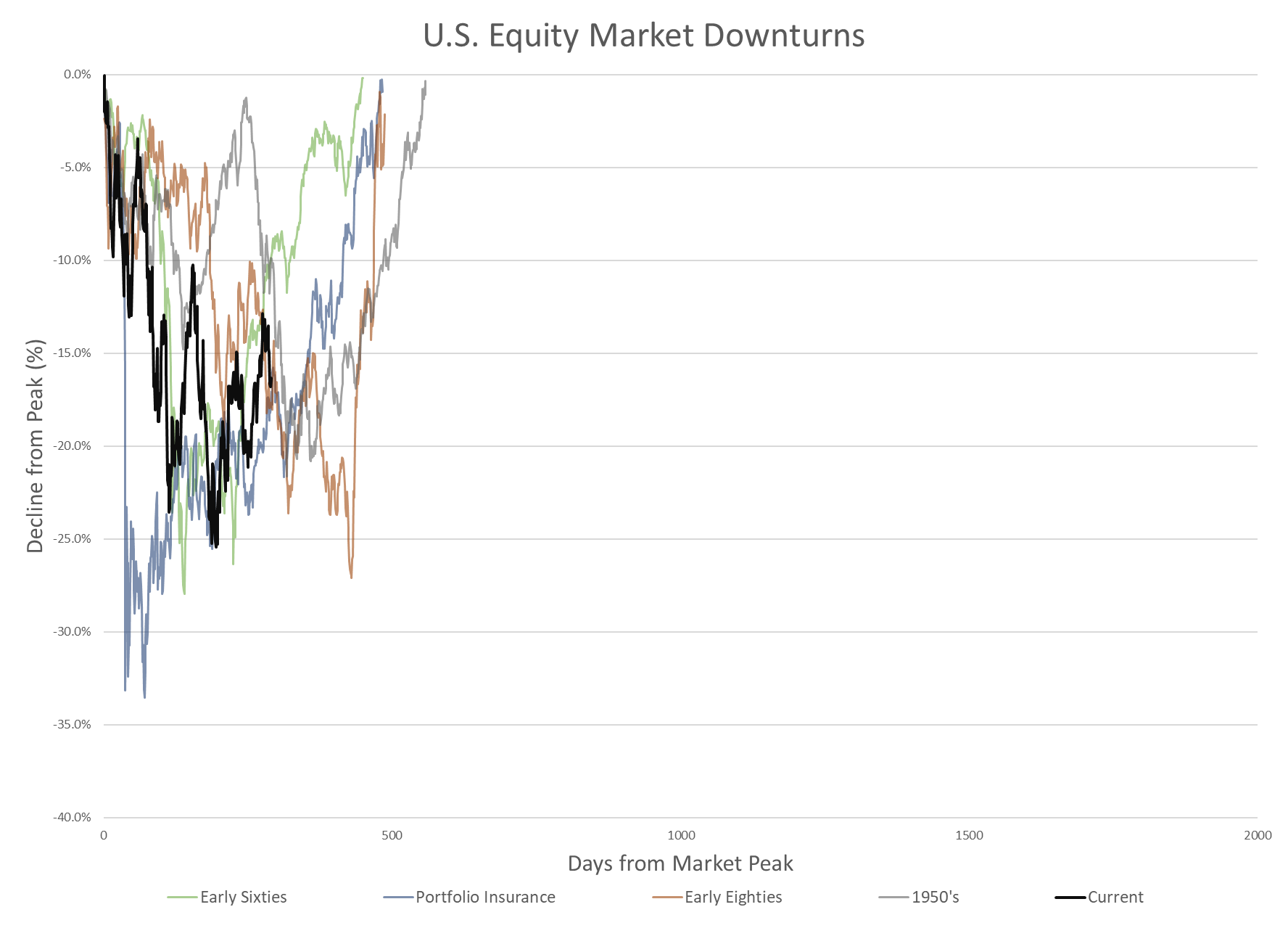 We will now move on to the four episodes where the downturns lasted between a year and two years. These included the 1950s, the early 1960s, the early 1980s, and the late 1980s. Like the short-term downturns, three of the four in the intermediate zone have some common characteristics. The 1950s downturn, the early 1960s, and the early 1980s were times when the Federal Reserve was actively fighting a rapid increase in inflation by restricting the money supply through increased interest rates (sound familiar?). In each case, the economy fell into a recession as demand declined due to higher inflation and interest rates. The standout was the late 1980s downturn. That period included Black Monday (October 19th, 1987), when the Dow Jones Industrial Index fell over 30%, wiping out all the gains for the year. The cause for the late 1980s has been attributed to pension fund protection strategies that went awry. Though the market dropped to its lows within days, it took almost two years to recoup the loss entirely. Putting that one aside, those driven by monetary tightening did not exhibit that same easy path upward. If you focus on the grey line in the chart below (the 1950s event), you will see that it nearly recovered within a year but fell again as inflation flared up.
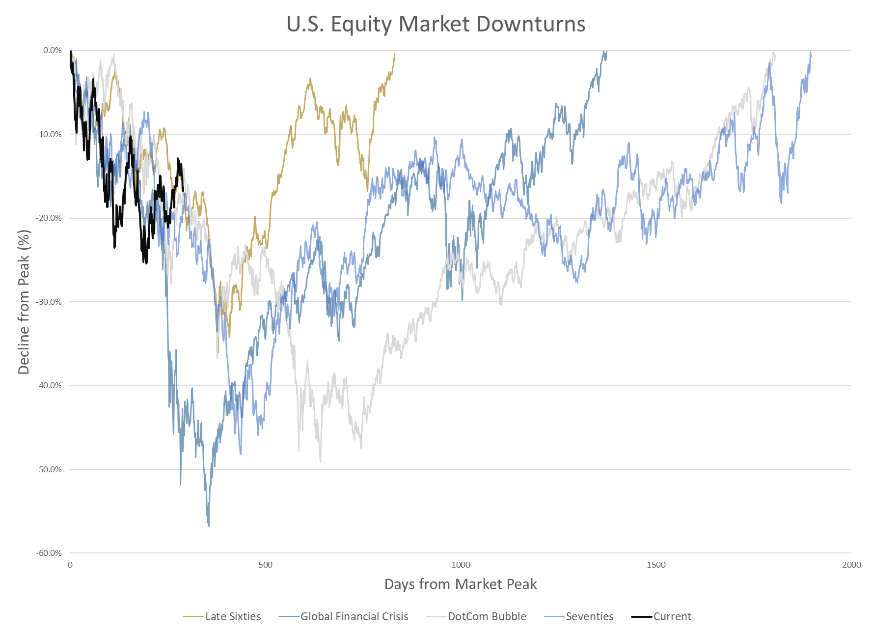
Saving the most painful for last, the long-term downturns also include four distinct periods (interesting that of the 12 downturns experienced, they were equally divided between short, intermediate, and long-term). They comprise the late 1960s, the 1970s, the Dotcom bubble, and the Global Financial Crisis. One item to note is that the 1960s was a decade where three significant downturns occurred. Though the decade showed a positive return over the ten years, it could have been smoother.
In this situation, all the prolonged downturns show some similar characteristics. In each case, liquidity became precious, and leverage within the financial markets needed to adjust from excessive levels. It was only in the 1970s that inflation was the primary culprit instigating a restrictive environment driven by the Federal Reserve. It was also the period where we had significant disruptions to primary commodities (OPEC oil embargoes). The other three episodes suffered from credit crunches but had different triggered events. The 1960s suffered as corporations and the federal government fought for funds. Corporations experienced a significant tax rise, and the U.S. government needed funds for a costly war. The Global Financial Crisis was driven by excess financial leverage and a significant housing downturn. And the Dotcom bust was due to working off past excess technology investments and the U.S. taking on a war stance after 9/11.
We consolidated a large amount of financial history into a few paragraphs, not properly reviewing any of the downturns. Still, we hit on the factors most attributed to each downturn. So, where does that leave us when looking at the current environment?
Since the current downturn has not recovered within a year, it removes the short downturn as plausible, leaving us with the question of whether we will return to prior market highs within the next year or take longer.
At this point, we don’t see symptoms suggesting this will take years to recover. The U.S. banks are in extremely good shape. The U.S. is a net oil exporter, so energy shocks should not become a long-term risk. We have seen excesses within some investment categories. Still, they appear to be isolated to areas such as blockchain and commercial real estate, so they are not likely to have a domino effect.
We end where we started—thinking we are going through the bottoming process. We have already experienced a material drop in public market valuations, allowing a higher probability that these prices will allow for healthy long-term returns. However, inflation is not yet under control. This gives the Federal Reserve reasons to continue a higher rate environment that will impact demand and likely increase uncertainty in the short term. Therefore, we continue a defensive stance with dry powder, looking for better entry points.
IMPORTANT DISCLOSURES
This report is for informational purposes only and does not constitute a solicitation or an offer to buy or sell any securities mentioned herein. This material has been prepared or is distributed solely for informational purposes only and is not a solicitation or an offer to buy any security or instrument or to participate in any trading strategy. All of the recommendations and assumptions included in this presentation are based upon current market conditions as of the date of this presentation and are subject to change. Past performance is no guarantee of future results. All investments involve risk including the loss of principal.
All material presented is compiled from sources believed to be reliable, but accuracy cannot be guaranteed. Information contained in this report has been obtained from sources believed to be reliable, Auour Investments LLC makes no representation as to its accuracy or completeness, except with respect to the Disclosure Section of the report. Any opinions expressed herein reflect our judgment as of the date of the materials and are subject to change without notice. The securities discussed in this report may not be suitable for all investors and are not intended as recommendations of particular securities, financial instruments or strategies to particular clients. Investors must make their own investment decisions based on their financial situations and investment objectives.